Tazo Tea
Original
Spec
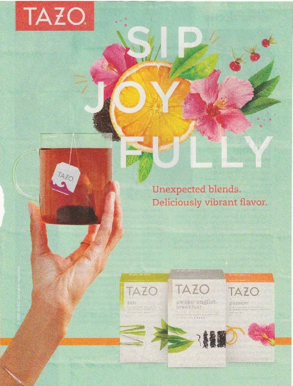
The original ad has a good tag line. "Sip Joy Fully" positions the tea as an incredibly bright, warm, source of happiness. The real star of the ad, however, is the packaging itself. It has a really appealing minimalistic design that ties into the line, "Unexpected Blends. Deliciously Vibrant Flavour."
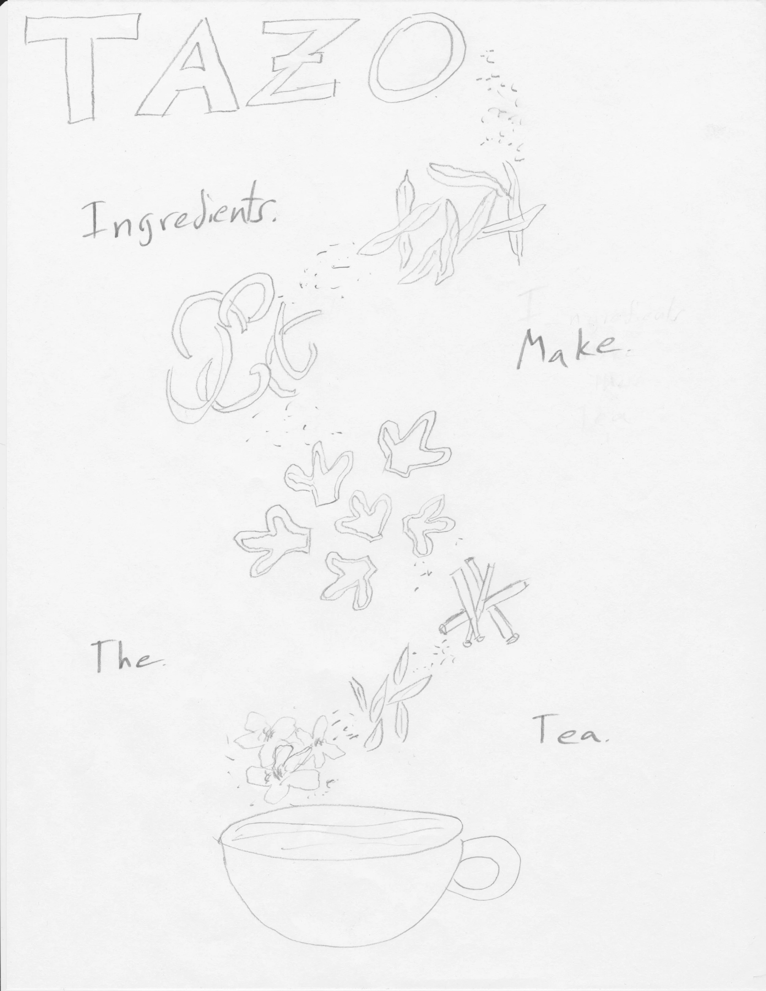
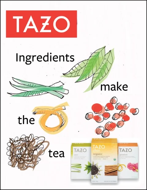
The weakness of the ad, in my opinion, is the imagery. The cup the tea itself is a boring shape, and seeing the teabag through the clear side is a bit unappealing. It's also being held awkwardly in the air by a hand jutting in from the side. The biggest issue to me though is that the most eye-catching part of the ad is the fruit and flower display on the top right. It really doesn't seem to speak to their actual ingredients. I wanted to create an ad that was clean, simplistic, and put the emphasis on the interesting blends of ingredients that they use. I wrote the line, "Ingredients Make The Tea" to show the purity of the beverage. The implication is that the quality and flavour of tea is intrinsically tied to the ingredients that are used. I also played around with lines such as, "Great Ingredients Make Great Tea," and "Simple Ingredients, Complex Flavours". Below is an alternative design I made.